As I have been preparing for the professional world as an animator, I’ve spent some time figuring out how to make myself memorable to potential employers. I started by building a website so I could showcase my work and make it all easily accessible when needed. When I started building the website the only thing I knew was what was going to be on it, my showreel, my films, my still art work and links to contact me. The problem I was faced with was the branding. Every brand has to pick a logo, a colour palette and a font, but when it comes to personal branding as a young artist, it’s hard to pin-point your exact style and what you want to convey, since this is still very new. I thought i would start simple, so I started by picking some colours.
I decided to pick a palette that reflects the colours I gravitate towards when drawing.
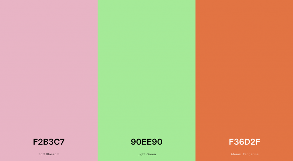
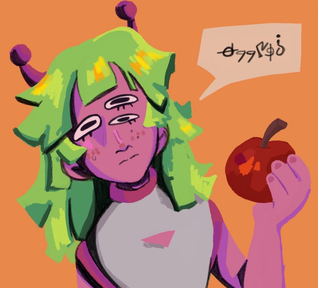
After deliberating I ended up with these three colours, they are vibrant and pop which reflects most of my work. The pink and green are also colours I chose for my most recent character design in my film.
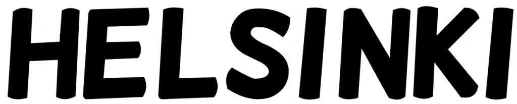
Looking at fonts is a never ending task, there are simply too many. After a lot of time I landed on Helsinki. My thoughts were that this font is playful, slightly informal yet dynamic.
Website
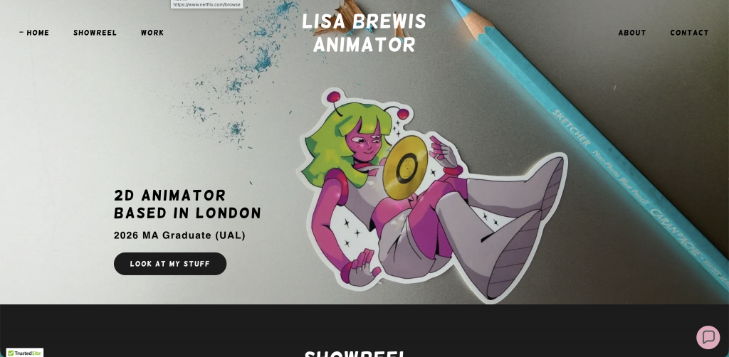
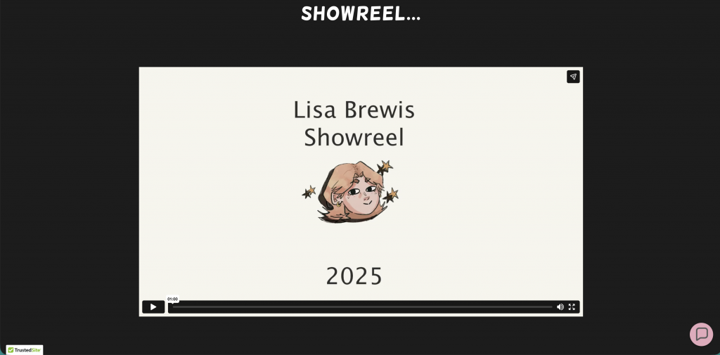
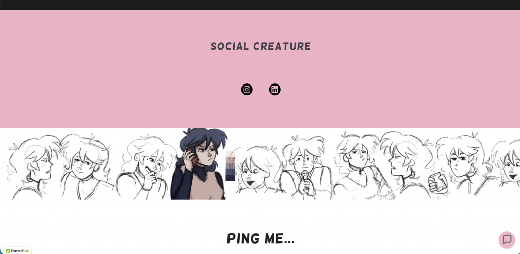
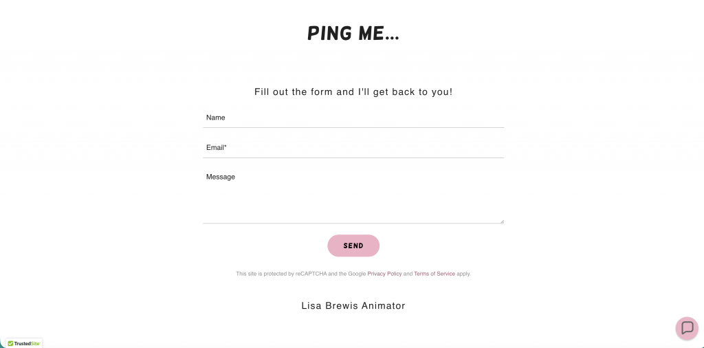
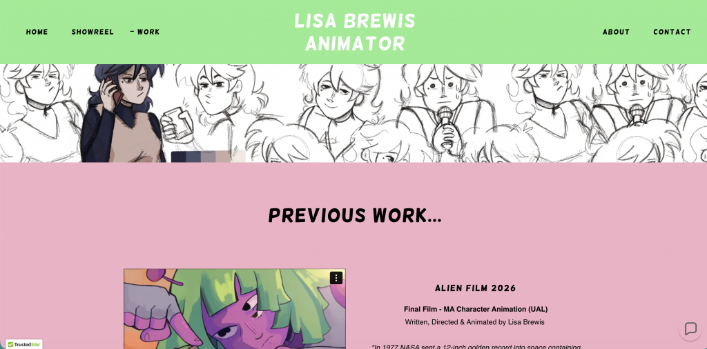
I used GoDaddy to host it and optimise it for all devices. I researched SEO (Search Engine Optimisation) throughout making this website and made sure to implement key words on the website to up the chances of it appearing in a simple google search.
The next step in my journey to build a personal brand and accessible backlog of my work was to print some business cards. Although it seems that business cards are a bit old fashioned in this digital era, I still plan on meeting people at film festivals and artist events, so I need something to give them.
Business Cards
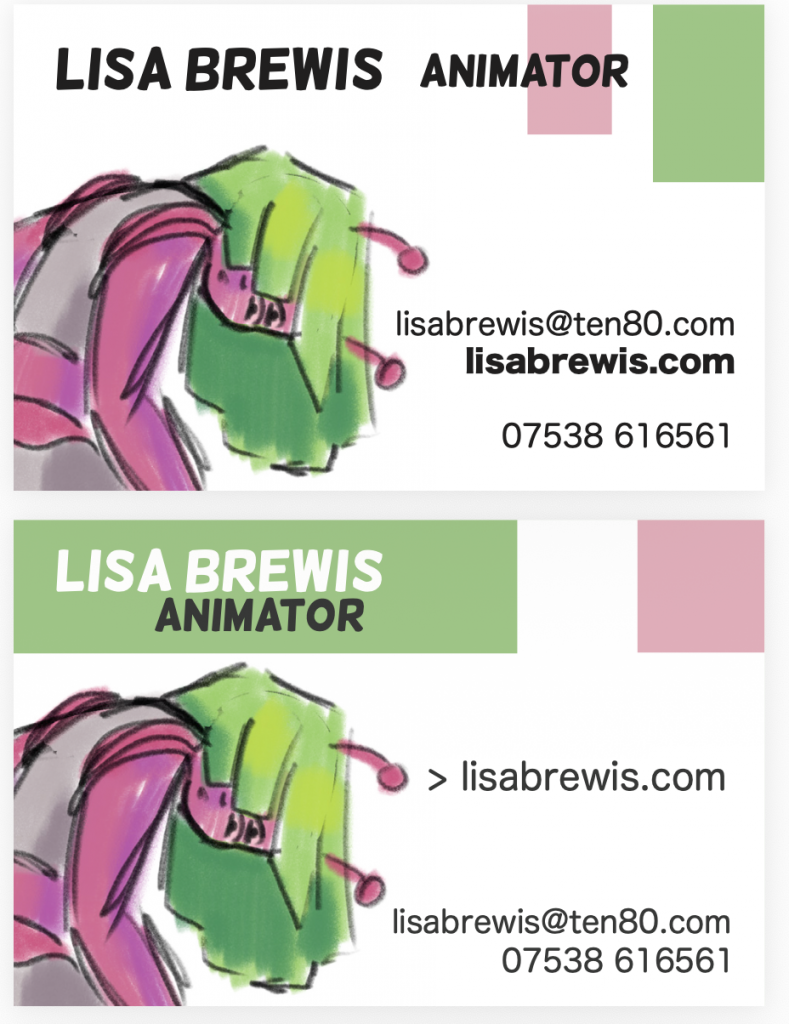
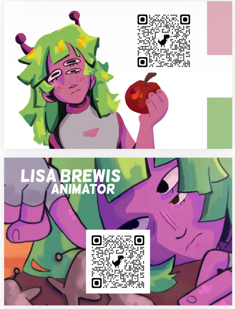
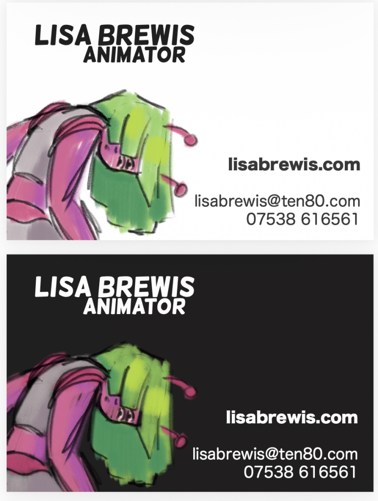
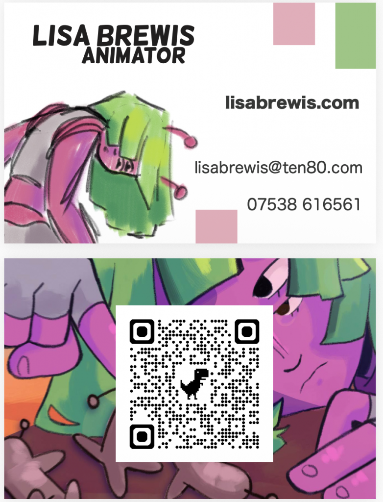
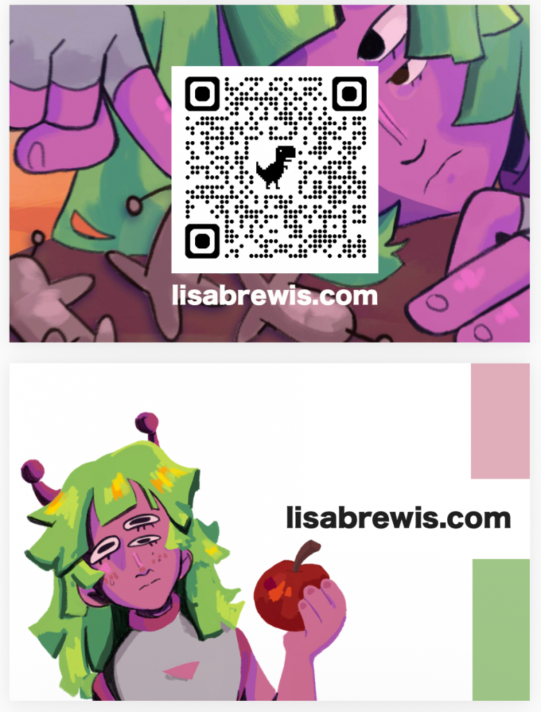
A lot of trial and error with different iterations of a similar idea landed me on this final business card:
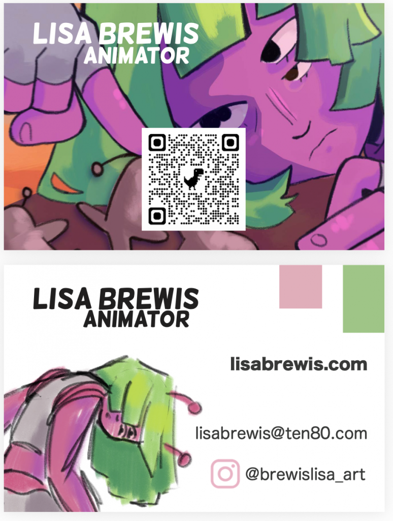
I used the Helsinki font to create this simple logo which appears in white on one side and black on the other. I went back and forth on wether or not I should use my telephone number but decided not to as a security precaution, instead I only linked the socials that I had created to showcase my work rather than any information that felt too personal or familiar. Finally I decided a QR code that links to my website would be the most optimal route since the least work people have to put it to access my work, the more likely they are to actually look at it. Making all my information accessible and not a hindrance to get to was really important to me while crafting this card. I know I still have a lot to learn about personal branding, but I’m hoping as my style as an artist and animator develops, the branding will come naturally and develop alongside it.
Leave a Reply